
Aligned Aesthetic: THE ENERGY BEHIND AESTHETIC
Today, we're beginning with a core truth I’ve come to know as a designer and intuitive creator:
Aesthetic holds energy.
It speaks before you do.
It sets the tone for your client’s experience, even in silence.
When we think of the word aesthetic, we think simply how something looks. Not how it feels. That is where the energetic piece fits into this topic.
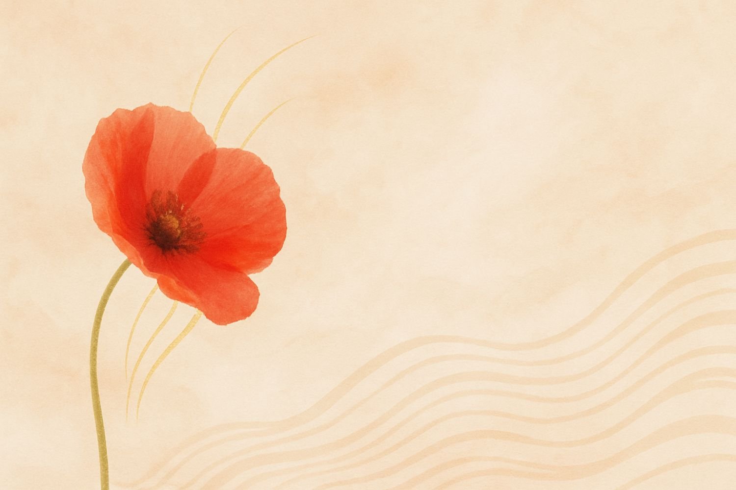
I LOVE aesthetics. It is one of my favorite things in the entire world. I tend to think it is both what I love about myself (that I can find and appreciate beauty easily), but also it ends up being expensive, so sometimes I dislike it about myself (haha). Let me explain: I will generally buy the prettier version of something, that may even get worse reviews, and be more expensive, all because it looks great sitting on my dresser or kitchen counter.
So what happens when we add alignment, and how we feel, to the way things look? We get the perfect combination of depth and beauty, to create something truly soulful. That is the goal of my brand, House of Poppy Creative; to make people feel something while scrolling down the page, seeing how beautiful graphics and serene color palettes can work together and create magic in your heart and mind. After all, how you show up is just as important as what you offer.
Form Meets Feeling
This kind of design honors both form and feeling. It invites your clients or community into a space that reflects the care, presence, and purpose behind what you offer.
In other words:
A soft, earthy color palette might reflect your grounding, nurturing energy.
Large amounts of white space may speak to your value of simplicity and sacred spaciousness.
Flowing script typography might embody the intuitive, heart-led way you serve.
Design choices become more than visuals—they become vessels for meaning.
Aesthetic as Energy
Everything in this universe is energy and carries a unique vibration. Which means aesthetic holds energy, and therefore vibration.
Every visual element on your site—colors, fonts, layout, white space, imagery—is a carrier of frequency.
When in alignment, your design does more than look good. It feels right. It resonates.
Examples:
A trauma-informed therapist may choose earthy tones and wide margins for safety and space.
A reiki healer might lean into soft gradients, fluid fonts, or imagery that feels light and ethereal.
A coach with bold, fiery energy may align with strong contrast and clean, decisive (maybe a soft font in uppercase) typography.
This is the energy of aesthetics. It’s not about trends or polish—it’s about presence.
What if your website, instead of being seen as just a digital business card, could be an energetic imprint? I like the sound of that better, personally. When someone visits a site I design, I want them to think and feel “yes, I trust this space”.